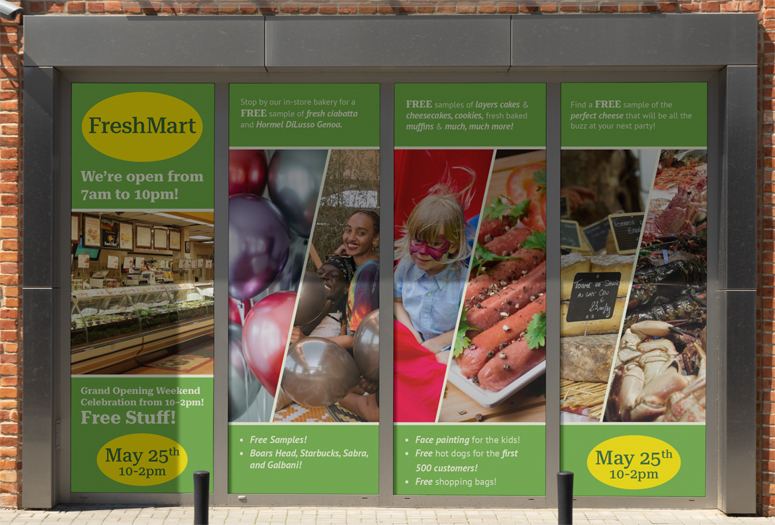
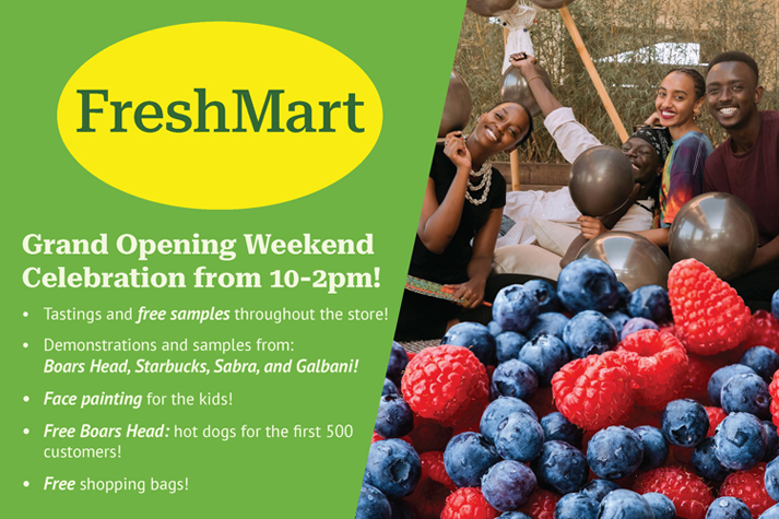
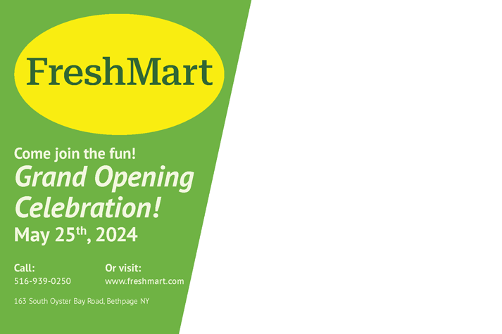
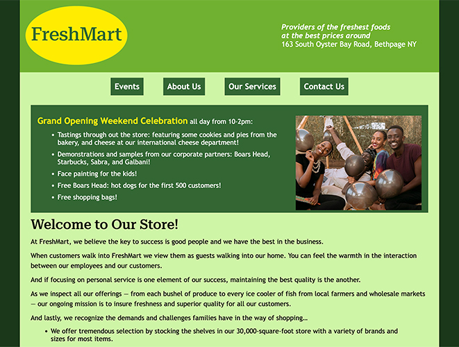
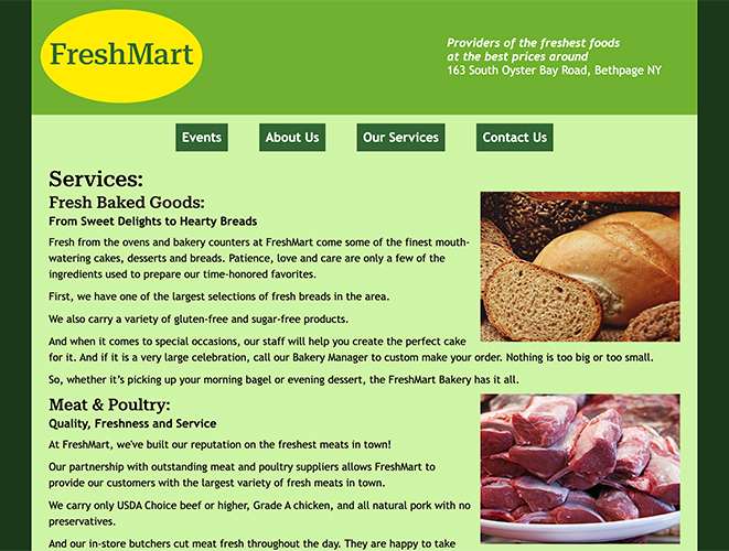
Supermarket Promotional Campaign
Context:
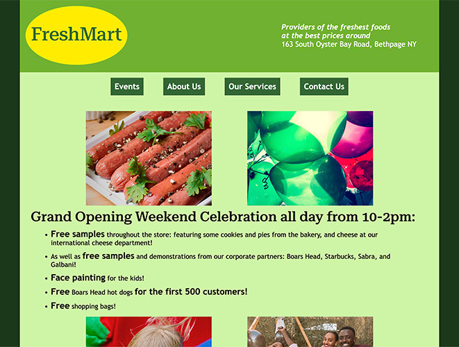
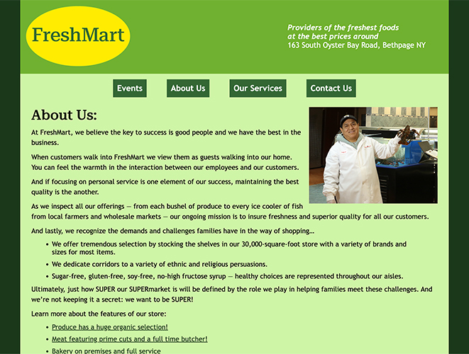
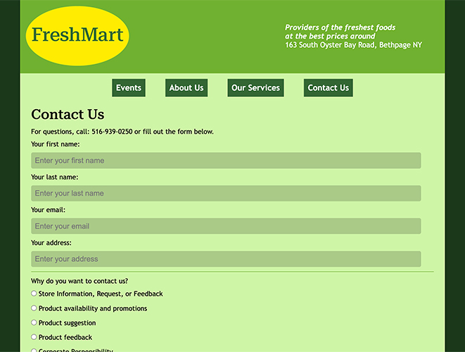
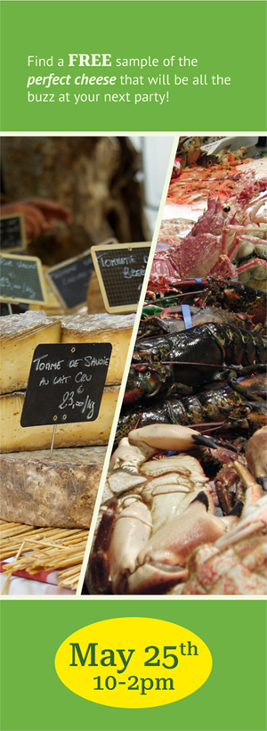
This project was based around developing the brand design, website, and promotional elements for a fictitious supermarket. After developing the brand and its elements, a website, postcard, and some window decals needed to be designed.
Project Content:
The color palette of the brand was centered around greens and yellows; the yellows help catch people's attention, while the greens help the brand be associated with fresh food and produce. The typefamily "Roboto Serif" was used for the logo and headings, while the typefamily "PT Sans" was used for the body copy and sub-headings. Once the brand design decisions were made, then came the production of the website, postcard, and the window decals' designs.


Credits:
- Photos by aureliofoxrj, davidvives90, NickyPe, FERMOSERGIO, TonyPrats, and JerzyGorecki on Pixabay
- Photos also sourced from Natalie Bond, spemone, RDNE Stock project, Royston-D-souza, PICHA, Tom-Fisk, and Gustavo-Fring on Pexels.