Infographic
Context:
This college project was based around producing an infographic to visualize data as to make it easier to understand by viewers.
Context:
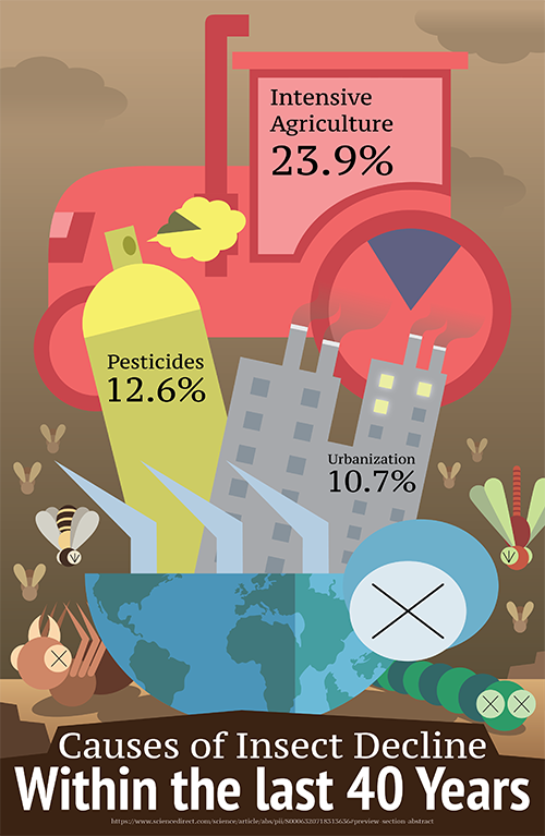
For the project, I went with the environmental issue of the decline of insects. After finding a reputable source for the data of the infographic, I began conceptualizing ideas for how to visualize the data. In the end, I decided to have the data be portrayed by visualizations of each threat to insect populations (urbanization with buildings, pesticides with a spray can, and agriculture with a tractor) jutting out of the carcass of a beetle like parasitic fungi. The beetle's body has patterns of the globe on it, representing the environment and the global threat of the loss of wildlife. The greater percentages of data are represented by larger visualizations that reach higher heights than the others.
To establish a grim tone for the environmental message, the background is dark and moody, with a sky that is brown with smog. At the bottom with the beetle carcass are other fallen insects, and above them are flying insects falling to the ground. The ground is dry and rocky, lacking any vegetation or plant life. Thus, an effective data visualization of a troubling environmental issue was produced.
Credits:
- Information sourced from “Worldwide decline of the entomofauna: A review of its drivers”
- Continent patterns referenced from WorldAtlas